Friday, February 24, 2012

week 5 blogs

 Silvestre Machado


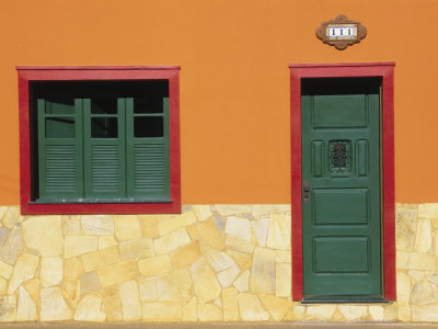
This photo is called Building of Stone with Shutters.  I like the colors in the photograph.  The analogous color scheme that is going on really works well.  I think it is interesting to see that door look like it is floating on wall.   the composition of the photo is nice i like the simplistic ness of the subject matter.  the stone wall has a nice texture to it, like it is not over powering the image but it is nice to see a random pattern to break up that saturated orange.   I found this photographer in B&W magazine, the color edition.  


http://www.art.com/products/p14371244-sa-i2911377/silvestre-machado-building-of-stone-with-shutters.htm?sorig=cat&sorigid=0&dimvals=5041187&ui=aead41e601b5435498f2ec604ed807ae


Robert Hale


Adelyn, i saw this photograph and i thought of you.  I like the texture of the image.  I think it is interesting.  This photographer is also from B&W magazine.  I think it reminds me of a painting or a painter like quality to it.  THis is from a series of works called water abstractions.  I think this image works compared to others.  Like it feels dynamic and has motion to it because of the ripples of the texture and the random like lines of the branches.  Some of his other stuff that i was looking through was nothing special i thought.  I think they looked nice but nothing else caught my eye.  i think the colors are muted but have a vibrance to them that is able to catch the viewers eyes.  and the design of the whole thing is nice as well.  
http://www.rhalefoto.com/Robert_Hale_Photographs/Water_Abstracts.html#1


Walter de Maria
This photo is untitled and it is located in the Museum of Contemporary Art in LA.  I like the landscape.  i think it is nice to see the form of the mountain and the negative space the clouds and the sky creates in the image.  i also enjoy the format by the way, i think it is nice to se more of the form of the mountain rather than seeing part or a section of it.  the texture of the mountain is nice, like we are able to see or actually feel it because of it.  it is able to show a nice sense of space and size as well.  


http://www.moca.org/museum/pc_artwork_detail.php?acsnum=84.12.4&page=3&classification=23&

Tuesday, February 14, 2012

week 4

John Baldessari


Six Couples: People and Animals  This photo is very interesting.  I like how the subject is colored in and is popping out and stands out from everything else in the photograph.  the colors that are used in the photographs are all complimentary.  Some of the photographs that are used in these look very common or photographs look like I have seen them before but because they are displayed with this color on top, it makes them different and pop.  I like the interesting format as well. I think that is mostly why i am drawn to this photographer.  


http://www.guggenheim.org/new-york/collections/collection-online/show-full/piece/?search=Photography&page=2&f=Artwork%20Type&cr=12


Sam Taylor-Woods
Five Revolutionary Seconds VII 

Ok i like this format.  or i think i do because now i am looking for cool and amazing photographs that work in this format and they are helping me see how i can shoot like this and what i can look for when i shoot.  I like how the panorama of the room it is able to show the environment of the space.  I think that lighting is nice how they used  it in space as well. i think it is nice that it is all natural lighting as well.  The figures within the work is nice as well.  i enjoy how they are scattered throughout the environment.  it helps show a sense of space and depth of it as well.  


http://www.artnet.com/artwork/425086122/424639131/sam-taylor-wood-five-revolutionary-seconds-vii.html


   Ryan Woodward


This animation was made for a music video and it is amazing.  the motion of the figures are fluent and seamless.  I think that this video is beautiful it shows that a simple figure drawing is able to turn into an amazing animation.  I think this makes me want to photograph movement. like dance and show the moments in between.      


http://www.youtube.com/watch?v=OBk3ynRbtsw


Monday, February 6, 2012

Week 3

Doug Richard 

This is part of an exhibition in the MoMA.  Richard takes pictures of ares with very little jobs.  He would look up these locations using Google Maps where he would than locate, take some photos of the location, and than digitally manipulate his photos with the Google Maps image with his own.  I like the color in the work.  i think it is beautiful.  I like the street view of it as well.  It is nice and the google image that is involved is not that notice able, like to just shows motions like the guy walking in the bottom left hand corner, it looks like he is walking but i think he was manually placed there.

http://www.moma.org/interactives/exhibitions/2011/newphotography/doug-rickard/


Mitch Epstein 

This photo is beautiful.  I like how he color is contrasting with the background.  how the gray makes the background muted and the foreground pop.  It is sort of color punctuation but not.....???  But the composition is wonderful and how the perspective is like off the ground, but not.......  The photo is interesting in general.  how the residential feeling is contrasting with  industrialization of the power plant.  It shows how close we are to industry.  And it makes ,e think is this a good thing? is this dangerous?


http://bombsite.com/issues/999/articles/3355


Eugene Richards 


This photo is from Eugene Richard's The Blue Room.  I think this is amazing!  The color of this room is beautiful. Like it shows that is is aged and it is abandoned.  The lighting is nice that show on the bed just adds to the photo.  It makes the photo give a cold feeling. it is weird like the temperature is cold or cool feeling but the sheets on the bed are warm so they are contrasting each other.  The lighting is nice as well.  It is subtle and not overly dramatic.  


http://reciprocity-failure.blogspot.com/2008/11/blue-room-eugene-richards.html

Friday, February 3, 2012

Week 3 Stephen Shore

Self Portrait

I think this is a successful picture that he took.  I like the arrangement of the subjects and of stephen himself.  i like how the figure is not necessarily the main focus of the picture, but the other subjects like the lamp and the record player  help add to the photo.  They show the environment of the figure.  The image is desaturated as well which i like.  The colors are not very bold and bright to stand out i think they are subtle and they add to the image.


When i saw this image i was like WTF.  Why would someone take a photo of this.  I do not like the composition, i don't like subject. i dont think it is interesting.  I think if he was going to take a photo of this than he might as well have just taken a photo of her vagina, with outher underwear on.  I do not think this is appealing to the human eye i dont think this works especially for some of his other stuff.


I like this print. I think this is successful.  The photo is nicely balanced like the darkness on the left is balanced with the darkness on the right.  And the light is centralized in the middle of the frame.  Also the fridge is nicely placed with the position of the door way.  This photo is very muted and is very nice.  I think it is interesting as well because of the ceiling being in the frame as well.  i think if the ceiling was not in the frame, the image would not work.


ALL OF THE PHOTOS WERE TAKEN FROM:
http://www.303gallery.com/

Sunday, January 22, 2012

Color Week One!

Brad Carlile

This photo is called Paccity3.  This photographer captures these colors not through artificial lights but through natural light.  he took this picture multiple times from one perspective.  This photo is really nice it show the color beautifully.  It is vibrant and full of light. i like the fact that the bed is not made, it looked lived or slept in.  I like that fact because if seems more human nature to leave a bed messy compared to leaving it all clean.  it makes the space looked lived in.


http://www.bradcarlile.com/portfolio/artist-statement-tempus-incognitus.html


Sarah Pickering


This photo is called Farrance Street, 2004.  This photo has color punctuation in it because of the doors in the back.  The colors of them are very bright and how a high saturation level to them that they stand out.  But i have to say that i like the gray as well the cinderblocks gives the image this industrial feel to the image.  I also like the image because the walls of the building lead you eye towards the back ground of the photo.  the trash in the alley way is nice as well it show the environment of the setting as well. The setting of the picture sort of contrast with the doors of the photo.  like the doors are these bright vibrant things that draw the eye while everything else isn't.  it is all gray and gloomy looking.


http://www.mocp.org/exhibitions/2010/04/sarah_pickering.php


Ok so i don't know who did this or where this is, i think Berlin maybe????    But you have to check this out because this is AMAZING!!!!!!!!   it is dynamic and creative and this is just a wonderful and influential.  It has inspired me to do a painting lol.  But besides that i thin it is creative and wonderful and just pure amazing!  Every time i see this my jaw drops!  


http://www.numen.eu/installations/tape-melbourne/


Tuesday, December 13, 2011

Week......... yeah i forget...

 Robert Mapplethorpe

i like this diptych.  i like the composition of it.  How one is sitting and the other is standing is nice.  i get two different feelings these photos.  one i get a proud, feeling or sense from while the other i get a sense of a blankness like no emotion.   the lighting is nice as well.
i dont like the mat of the photographs though.  i think if they were white or black they would be interesting and make the photographs pop.  


http://www.masters-of-photography.com/M/mapplethorpe/mapplethorpe_smith.html


Lothar Wolleh


This photo i love.  i like the negative space. i think it is beautiful.  and the figure is place nicely in the frame.  and the only thing that is breaking up the whiteness of the walls is the black lines. i think it is interesting because of how blown out the print is.  but i love it


://masters-of-photography.com/W/wolleh/wolleh_delaunay.html


Jill Greenberg

AHHHHH!!!!!!1  this is amazing!!!!!!!!  i think this series of work is amazing! the emotion that comes out of the pictures are just powerful.  i think these are strong and can hit someone in the face with these pictures.  The color is nice and very picture is different.  all the kids are in different poses or positions and every little child cries differently as well so their emotion on every one of their faces are different.  I love it!

Monday, December 5, 2011

week something or other......

Brian Duffy
This is a photo that was taken by Brian Duffy and the model is Jean Shrimpton and was taken in 1963.  I like this because of the tonal range mainly.  I like how white the figure is in the photo and there is not a lot of variety on grays and black.  I like the simpleness of the photo as well.  and the expression on the face is amazing as well.  

http://www.duffyphotographer.com/archive_faces.html


Jay Maisel


I like the lighting in this photo.   How the only light that is being produced is because of the head lamps of the miners.   I think the negative and the positive space that the light creates is interesting as well.  And how yellow it is as well.  

http://studio.jaymaisel.com/collections/portfolio


Joan Myers   

  This is from a series from western power.  I like that it is symmetrical but it is not at the same time.  And the geometric shapes does wonders as well.  I like the monotone color scheme as well.   It makes the image more powerful.   I do think that there is a lot to look at in the photo but only if you look deep into the distance of the power plant but i think over all this is a wonderful print. 

http://www.joanmyers.com/westpwr3.htm