Tuesday, December 13, 2011

Week......... yeah i forget...

 Robert Mapplethorpe

i like this diptych.  i like the composition of it.  How one is sitting and the other is standing is nice.  i get two different feelings these photos.  one i get a proud, feeling or sense from while the other i get a sense of a blankness like no emotion.   the lighting is nice as well.
i dont like the mat of the photographs though.  i think if they were white or black they would be interesting and make the photographs pop.  


http://www.masters-of-photography.com/M/mapplethorpe/mapplethorpe_smith.html


Lothar Wolleh


This photo i love.  i like the negative space. i think it is beautiful.  and the figure is place nicely in the frame.  and the only thing that is breaking up the whiteness of the walls is the black lines. i think it is interesting because of how blown out the print is.  but i love it


://masters-of-photography.com/W/wolleh/wolleh_delaunay.html


Jill Greenberg

AHHHHH!!!!!!1  this is amazing!!!!!!!!  i think this series of work is amazing! the emotion that comes out of the pictures are just powerful.  i think these are strong and can hit someone in the face with these pictures.  The color is nice and very picture is different.  all the kids are in different poses or positions and every little child cries differently as well so their emotion on every one of their faces are different.  I love it!

Monday, December 5, 2011

week something or other......

Brian Duffy
This is a photo that was taken by Brian Duffy and the model is Jean Shrimpton and was taken in 1963.  I like this because of the tonal range mainly.  I like how white the figure is in the photo and there is not a lot of variety on grays and black.  I like the simpleness of the photo as well.  and the expression on the face is amazing as well.  

http://www.duffyphotographer.com/archive_faces.html


Jay Maisel


I like the lighting in this photo.   How the only light that is being produced is because of the head lamps of the miners.   I think the negative and the positive space that the light creates is interesting as well.  And how yellow it is as well.  

http://studio.jaymaisel.com/collections/portfolio


Joan Myers   

  This is from a series from western power.  I like that it is symmetrical but it is not at the same time.  And the geometric shapes does wonders as well.  I like the monotone color scheme as well.   It makes the image more powerful.   I do think that there is a lot to look at in the photo but only if you look deep into the distance of the power plant but i think over all this is a wonderful print. 

http://www.joanmyers.com/westpwr3.htm

Wednesday, November 30, 2011

Week something or other

Emmet Gowin


This shot was taken by Emmet Gowin.   I like the circle in of branches that is surrounding the figure.  I think it help contains the viewers eyes.  Also I think that the circle is symbolic for life as well.  The tones, which there are not many of because of the contrast works very well with the imagery and helps with the mood of the photo.


http://derrickoniapineconeus.blogspot.com/2009/03/emmet-gowin.html


Joel Meyerowitz


I like how the circle is blocking the woman's face.  It makes me think why?  was her face ugly? was she so pretty that if he took a picture of her face. would she break it? the world will never know.  Also I like the angles that are going on with the window.  It helps draw the eye towards  the woman.


http://www.joelmeyerowitz.com/photography/books_enlarge.asp?bookvar=3&pixvar=10


Amanda Ross-Ho


Irreconcilable Indifference is the title of this work.  The photo makes me think of questions and i wanna know more about it.  Like the eyes.... Why are they cut out?  and i like how the child is holding the crayon showing that he did the drawing on the faces.  I like how the color is mainly on the child and the crayon.  It emphasizes the color and makes the black and white photo sort of stand out more.


http://www.moma.org/interactives/exhibitions/2010/newphotography/amanda-ross-ho/irreconcilable-indifferences/

Monday, November 21, 2011

week idk....

robert mapplethorpe


This photo is called Lisa Lyon and it was taken in 1981.   First off the texture that is shown on the figure is amazing.  I like how it looks like the paster (i think that is what it is) is covering the entire figure.  And how it crackles from the front of her body to her back side is a nice touch as well.  It shows this aging affect to the figure and I think it is interesting.  Also i the fact that she still has a ring on her finger adds this affect that she was stuck like this.  And i think it was left there on purpose and it has a meaning on commitment as well.        


http://www.mapplethorpe.org/portfolios/female-nudes/?i=2


Frederick Sommer


The blur here is used beautifully in my opinion.  I think that the out of focus is needed too an extent to make the image interesting.  I think if the image was in focus it would look like any other portrait of a woman.  And how it was printed is well done also.  The hair of the figure is dark and the tonal range of the figure is wonderful.  You can sort of get this volume of the person in the photo.


http://www.fredericksommer.org/index.php?category_id=11&gallery_id=127&piece_id=1066


Jeff Wall


This photo is called Storyteller.  I like this because of the stetting is so simplistic and not the usual place one would take a photo at.  I like that because it is like exposing a unfound place, a place where people like to hang out and chill. I like that the colors are very simple they are not extremely vibrant or over powering i think that it is simple.  This is printed big as well so you can see all the details that are in the photo and it is amazing.


http://www.tate.org.uk/modern/exhibitions/jeffwall/rooms/room4.shtm

Thursday, November 17, 2011

week something.....


Alvin Langdon Coburn


So this right here is a vortograph.  This is when you make an image by repeating it multiple times making the image abstract.  I think that this photo is interesting because of the abstract shapes and how there is a sense of motion that is going on in the photo it gives the image a more dynamic feeling to it.     


http://www.geh.org/fm/coburn/alcoburn/m196700980028_ful.html#topofimage  


Roger Fenton


This photo is called The Double Bridge on the Machno.  It is by Robert Fenton and was taken in 1857.  i like the shape of the image.  I think it is different and a unique boarder.  The tones in the image is nice as well.  And the sense of blur is interesting and adds to the picture.


fenton_double_bridge.jpg


Lewis Hine  


  I think being able to capture a moment like this is beautiful.  The figure is just standing there thinking.  It looks like she is in a daze.   It shows the quiet moments in life, especiallye you are at work.   

Saturday, November 5, 2011

week.... 10?

David Levinthal


This photograph is by David Levinthal and it is from a series called Modern Romance and it is from 1084-1986.  I do but i don't like this photo.  I like the fact that it is a scene you can witness in reality and he was able to achieve that by using dolls.  I like the composition of the figures as well. i think that it makes it more realistic.  But what i don't like about it is the lighting.  i think it is too over powering.  But i have to say that this photo also reminds me of maps' photograph that he is doing now because it looks like it was shoot from a security camera.


site:  http://www.davidlevinthal.com/works.html


Klein  


This photograph i think in interesting.  How these shadows are formed behind the black tiles and how it has this sense of motion is amazing.  I like the positioning of the figures in the picture as well.  I think that this photograph has this pop art feel to it almost because of the retro style and dynamic feel to it, except it is only in black and white......


site:  http://www.all-art.org/20ct_photo/Klein1.htm


Christopher Becker


This photo is by a contemporary photographer from his series of night landscapes.  I like this piece because of the motion that trees have.  The swirling just captures your eyes and makes you wonder around the image.  I like the light as well i think that doesn't over power the photo as well.  

Sunday, October 23, 2011

week 8

Clarence John Laughlin

This piece was taken by, Clarence John Laughlin and it is called The Appearance of the Anonymous Man.  This is a nice piece of work, it is simple ish, but full of meaning.  The person in the photo has a veil on to represent her being unseen because they are dead.  Though out his work Laughlin uses veils to help represent spirits or death, and this is because he wants to portray them as ghost or spirits of New Orleans.  And the wall, that has the holes in it is amazing it shows the world around us is decaying.


http://www.flickr.com/photos/doncolin/425362973/in/photostream/lightbox/


Max Waldman 

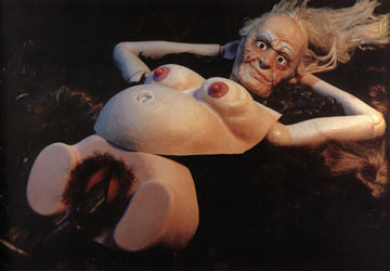
This photo above is called Experimental Nude #5  I love how abstract this is.  The tonal range is beautiful and there is some grain there as well.  I think those two things adds to the picture itself.  and if you look at it, would one really think it was a person?  i wouldn't.  But also there are these curves and riffles and this volume that this picture has that is beautiful.  It show \s this weird shape, this abnormal composition.   

http://www.maxwaldman.com/pages/nude5.html


Minor White


   This is called Barn and Clouds by Minor White.  I really like this photograph because of the sky.  I think the dark sky contrasting with the white gray clouds look amazing.  and than how the barn is almost as dark as the clouds is mimicking each others.   The photo too an extent looks a little surreal to a certain degree. it makes me think did he use infra red film to make this photo how is it or is it just a negative print........


http://www.dptips-central.com/minor-white.html

Sunday, October 16, 2011

umm...... number 7?

Henry Callahan
This photograph was taken by Henry Callahan back in he 1970s.  I like the image because of the surrealism in it.  I think it raises questions due to the figure in the background and the egg shaped circle that is in the middle of the image as well.  The haziness that is on the outside of the circle has this beautiful landscape in it and it allows your eyes to focus on the middle circle.  I enjoy the fact that the photographer made a oval, egg like shape instead of circle because it adds another element to the image.


site: http://www.stephendaitergallery.com/dynamic/artwork_display.asp?ArtworkID=2279


Josef Koudelka

This photograph is by Josef Koudelka and it was taken in Greece of 1994.  The image above give a feeling of isolation.  A sense of loneliness because of the single tree that is standing on its own.  And that tree is oddly shaped, and is dark and stands out compared to other trees.  Also the misty fog that is in the background  add to the photo, it adds to that feeling of isolation and loneliness.   The trees on the right are interesting as well.  They are extremely different compared to the small one.


Natasha Gudermane


This photo is by Natasha Gudermane and i find it interesting.
I like how the face lines the bottom of the frame.  It is attracting too an extent because it is not the normal composition of a face.  and the television being on adds to the image.  It makes you think.  ANd the fact that the walls are bare and how simple the objets are in the photo and i think it adds to the image.  

Saturday, October 8, 2011

week.... i forget already.....

Lewis Baltz

This photo is called Nevada, 1977 and it is by Lewis Baltz.  This photo has some nice lighting because how the silo-wet of the mountain is dark and the house is bright.  I think that the mountain in the background is mimicking the shape of the house.  Also i think that it is going with the stuff that i have been working on now.  That is possibly I like it.  I like the composition of the house as well.  It is not perfectly centered and it makes the mountain in the back look centered.


Site:  http://www.artnet.com/artwork/426108317/684/lewis-baltz-nevada-1977-a-sequential-work-with-15-elements-element-no-8.html


WEEGEE


So this photograph is taken by the one and only Weegee.  This picture can make people question why is that light is bright.  I like it. Ok so i know it is on a movie theater but that is the projection light.  but why is it so bright?  what was his reasoning for it? It was done my a long exposure.  But it is just interesting.  ANd i like how dynamic it is as well.

site:  http://www.amber-online.com/exhibitions/weegee-collection/exhibits/017


Joel-Peter Witkin


This photo is by Joel-Peter Witkin and it is called "Beauty has Three Nipples" and it was taken in 1998.  THis photograph is different.  I like his technique I will say that he scratches your negative and manipulated them as well.  He would sometime bleach his prints in the printing process and toned some of them as well.  He was inspired by living with a freak show and he found love there, but when he could not live with them he decided to take pictures of "freaks".  I think i like how he executes his photography more than the subject matter.  I say this because i am interested in him technique and how he printed his work.

Sunday, October 2, 2011

Week 5


Cindy Sherman

This photo was taken by Cindy Sherman and it is titled Untitled #250.
I like this photography because of the bizarreness of it.  And I like how are uses the mannequins as well. I think it just is different.  But I like it because of the  composition of the figure and the poster of it as well.  And the eyes of this figure seems lie ti is staring right at you and it is sort of scarryish.  Like it is starting you down.    


 web site:  Untitled250.jpg


Bruce Davidson


This photograph is by Bruce Davidson and and this sort of reminds me of a photo i took back in high school.  The photo I took back in high school.  I love the composition of the person where he was placed is very nice. I like that he doesn't take over the frame and i like that you can see the background.  The background is very interesting with this hazy sky and the circus tent.  I think that it makes the photo and helps the viewer to see that this might not of been staged that it was a decisive moment.


site:  http://www.magnumphotos.com/C.aspx?VP3=ViewBox_VPage&VBID=2K1HZSKA1WFE&IT=ZoomImage01_VForm&IID=2S5RYDWD5MJR&PN=4&CT=Album


Todd Hido


This Photograph is numbered 2312a and it is by Todd Hido.  I like the light that is being show in the sky.  I love the shadows as well. I think these two features of this photo gives it a creepy feeling.  I like the coolness of the photo as well.  I think i adds something else to the photo and it contrasts with the warm colors of the leaves on the tree.  normally Todd likes to have a light on in the house when he photographs but this one he doesn't which is odd.  


Site:  http://www.ahornmagazine.com/issue_6/interview_hido/interview_hido.html

Sunday, September 25, 2011

Week 4

William Eggleston


This photograph was taken by William Eggleston.  It is a very simple photograph and it is beautiful.  People say that he is the invited or created color photography, but he wasn't.  He was just on of the first people that used it and was able to make these wonderful photos with it.  The perspective of this photo is wonderful.  I like how it is  dominates the photo and i also enjoy the depth of field.  I think it is an interesting photograph and a wonderful picture.


http://www.egglestontrust.com/


Jerry Uelsmann


This is one of Jerry Uelsmann's earlier works.  I like this because of how the reflection of the top is in its negative form.  I think that is amazing.  That really captures my eye and i love how there are shadows of people or the children are white.  I think it gives it a creepy quality and i like the tonal range of this print as well.  This photo really keeps my attention and i think it was executed very well, especially since it was one of his newer works.  And on top of it all he did all of this in the darkroom.  That is extremely impressive.  This photo is called Small Woods Where I Meet Myself.


uelsmann_small_woods.jpg


Alec Soth


This photo comes from a project that Alec calls The Last Days of W.  I am drawn to this photo. I like the expressions on the women's faces because they are both different.  And by being different it makes you thing.  Is the viewer intruding on a moment that they were having or is that how they feel right at that second.  Also By having their legs somewhat crossing makes me think.... Are these two gay? are they lesbians? or are they prostitutes.  I also like how the color is portrayed in the photo as well.


http://alecsoth.com/photography/projects/the-last-days-of-w/

Monday, September 19, 2011

Portraits......

Meatyard


This photo is by Ralph Eugene Meatyard, I like this photo because it is a different photo compared to the other stuff he shoots.  I do like the whole mask thing, and the creepiness feel they give off. But This photo reminds me of a photograph that I took.  But the emotions hat are portrayed in this photo are strong and the house in the background is a nice touch to contrast with the lightness of the foreground.


Rinkeke Dijkstra 

   This is one of my favorite/ top photographers of all time!  I think her work is amazing and they are not just the typical portrait.  I think her pictures of full of these amazing situations and stories.  This photo is one of my favorites.  The little girl has this expression on her face that just love.  It is just straight,  hiding the emotion of all that she has been though. I like how neutral the background is compared to her dress as well.  It is a nice contrast.  And this photo over all is  just amazing because of this photographer would track this girl down every year and photographer.  Dijkstra did a series on her and the series is amazing!


Steve McCurry

 This photo is called Mother and Child.  It is by Steve McCurry, some of his stuff was in National Geographic, and his famous picture that he is most famous for is the Afghan Girl.  But i this one more.  How the water is on the windows and how the hand is touching it.  I love it.  But the look in the mothers face is subtle but the look on the face of her child is more amazing.  I like the fact that all colors in this are dark besides the dress of the mother.  It stands out and tries to brighten jup the photo.

Saturday, September 10, 2011

Weirdness...........


Bill Brandt

Campden Hill is a photo that was take in London in 1953. This photograph was taken at an interesting angle and perspective causing the model to have these enormously large arms and big hands.  I enjoy how Brandt is distorting the human body, making it seem different.  I enjoy this photo due to the contrast that the photographer used to create this picture.  It makes the picture all around more dramatic.  The figure or the subject looks like it has a feeling of plasticity making the model feel cold and fake.  


artwork_images_119642_415393_bill-brandt.jpg


Herb Ritts


This photo was taken in 1989 and it is called Djimon With Octopus.  This photograph is beautiful.  It is weird because there is an octopus on this persons head, however it brings the photo together.  I believe that if this sea creature was not on the head of this person,  this picture would just be a typical portrait.  ANd I love the fact that the eye of the sea critter is open as well because the model's eyes are closed.  The contrast on this photo is beautiful, it shows a nice variety of tones shadows ad highlights.

ritts_2_b.jpg


Arthur Tress

This photo is amazing!!!!!!!!  I do not know how he did this or if he found this or what not but i believe it is beautiful.  THe expression on the face is what i think makes the whole picture.  Also the tonal range is beautiful as well.  THe composition is ok.... but because the head of the figure is up so much, it makes the composition work.  THis is just a weird and unique photo that was captured in a beautiful way.   ANd i like the background as well.  The setting of this photo is interesting and adds to the photo as well.  It is called Singing Chair and was taken in 1977


singing_chair.jpg

Monday, September 5, 2011

Land people and a combination

Ansel Adams


The picture to the left is a photo taken by Ansel Adams.  It was taken at Yellow Stone National Park and in the year or 1948.  This photo has beautiful contrast between the tree trunk and the white of the snow.   I believe that the photo's composition is not very interesting but the subject itself is.  The tree's branches look very ornate and fragile which give the photo a exquisite and elegant look.   The tree looks extremely large compared to the other trees that were in the background of the photograph.   It makes the viewer wonder if the tree is really that big of if he took the photo from an interesting perspective.


http://www.pbs.org/wgbh/amex/ansel/gallery/gal_ansel_10.html


Diane Arbus


here we have a photo called Puerto Rican Woman with a Beauty Mark which was take in 1965.  First off i love the composition of this photography.  It takes up the entire frame with allows the viewer to focus on the subject.  Also how this image is so close up to the woman is nice as well.  It is nice because normally when one does portraits, it is of their whole or has more of their body in it.  this one is just their head with makes the photo a little more personal.


http://masters-of-photography.com/A/arbus/arbus_mark.html


Jerry N. Uelsmann


This photo is a combination of the two.  He does multiple exposures.   I like how he merges the landscape and the portrait of the woman into one photo.  it has an interesting composition and a uniqueness to it as well.  The contrast of the photo is beautiful as well.  There is an amazing amount of detail that is shown here and the photography is assembled beautifully


Jerry+Uelsmann.jpg

Tuesday, March 1, 2011

Surrealism/dreams

Here in the right is a photographer named Dan Mumford.  i like this photograph because of the exposure.  The castle being combined with eh head of the woman is very nice.  i like how her hair is also not just hair but it is plants or trees.  i think this is an interesting photograph.  I believe that this is an interesting take on a classic or "standard" portrait of someone.  


Above us right here is an amazing photography by Scott Mutter.  Here we see another multiple expose photo.  I think that the photographer has amazing ideas with his prints and what images to combine.  I like how the backround is foggy and hazy, and i also like how the door fits perfectly inside the rock.  
 I found this image at http://www.photographymuseum.com/mutter/revolving.html


Here above me is a photograph by Duane Michals .  The title of this piece is "Magritte with Hat."  I like the simplicity of the photo.  I think that the simpler the better sometimes.  However, the photo is complex as well.  I think that the layers of this photo is very  nice.  I do not believe that he as just two layers but he has exposed it three time.  I found this photo at  http://chagalov.tumblr.com/post/2346118735/magritte-with-hat-1965-by-duane-michals-via-ma


Tuesday, February 22, 2011

Abstract Photography


Mark Raymond Mason did this photograph that is abstact.  The lines in this photogrpgh to the rightare very curvaliniear and is able to lead your eye around the picture nicely.  I also like how the blots of whatever it is get smaller as they decend back into space.  The site where i found this photo from is http://www.markraymondmason.com/C01370BW.php


Here on the left, i found this photogrpahy by this russian photographer, Ciro Totku.  The series of photos by this photographer were taken in Cambodia.  I found this photograph interesting.  I beleive this because the the interesting compostion of the things that are hanging off the wall.  Also I like the shadows that the things that are hanging off the walls are casting and i think that the photo is more interesting becasue the wall is not perfectly white.  Because of this, the wall show age and rusticness.  i found this photo at http://www.totku.com/advertising.html


Here on the right is an x-ray photo that was taken by Walt Wenzel.  I do like this photogrpahy, because of the amazing glow of the shell.  Also i like how the veiwer is able to see the outside but the inside as well.  I beleive it is neat and interesting what photographers are able to do now and days with the technology that we have.  It makes me think about the futurer and what it may be able to bring us and the ideas that  could let us complete.  I found this at http://www.google.com/imgres?imgurl=http://waltwenzelphoto.artspan.com/show-image/899684/Walt-Wenzel/White-tibia.jpg&imgrefurl=http://waltwenzelphoto.artspan.com/large-view/Inner%2520Dimensions/245314-4-0-19955/Architecture.html&usg=__m5mZ9G14rAKFgSSrHCLQTEhzFpY=&h=500&w=382&sz=44&hl=en&start=0&zoom=1&tbnid=hvKFpRkm0UTKNM:&tbnh=149&tbnw=144&ei=aBFkTeDmCsH38Aars9HhCw&prev=/images%3Fq%3Dwalt%2Bwenzel%26um%3D1%26hl%3Den%26safe%3Dactive%26sa%3DN%26rls%3Dcom.microsoft:en-us:IE-SearchBox%26biw%3D1499%26bih%3D798%26tbs%3Disch:1&um=1&itbs=1&iact=hc&vpx=1268&vpy=82&dur=140&hovh=257&hovw=196&tx=127&ty=140&oei=aBFkTeDmCsH38Aars9HhCw&page=1&ndsp=30&ved=1t:429,r:6,s:0


Wednesday, February 16, 2011

Perspective.....

Tierney Gearon uses a persective from a child's point of veiw.  By useing this point of veiw we are wble to see the, maybe not see but even feel how small the childrem are.  Also from this perspective the viewer is able to see more of the childre with their masks on and not be consumed with the bright background.  The link where i found this picture is http://www.tierneygearon.com/.


On the left here, there is photo by Rudolph de Ram.  HE named this photo "Sky Scratcher."  The site where i found this pictue is found athttp://www.deramphotography.com/large-single-view/gallery/269906-8-9993/Photography/Black%20&%20White/Nature.html.  this photo demonstrates a perspective that is like a ant's view.  This photo has good composition and the contrasting grays a nice.  And also the black cloudy boarder is able to contain the veiwer's eye with in the subject matter, which I like.

 
 Here on the left, there is a photograph from B&W Magazine.  The image was found here  (http://www.bandwmag.com/galleries/nude/100.1.jpg).  The perspective of this image is very nice.  The angle from which the picture was taken is different compared to others.  I think that when one is looking at a subject from this type of angle, the subject would be buildings, not a woman.  The composition of this piece is nice and the format in which the picture has been printed on is nice as well.  the long image is able to sort of compliment the body of the woman.  It also makes the photograph flow better as well.