Saturday, October 8, 2011

week.... i forget already.....

Lewis Baltz

This photo is called Nevada, 1977 and it is by Lewis Baltz.  This photo has some nice lighting because how the silo-wet of the mountain is dark and the house is bright.  I think that the mountain in the background is mimicking the shape of the house.  Also i think that it is going with the stuff that i have been working on now.  That is possibly I like it.  I like the composition of the house as well.  It is not perfectly centered and it makes the mountain in the back look centered.


Site:  http://www.artnet.com/artwork/426108317/684/lewis-baltz-nevada-1977-a-sequential-work-with-15-elements-element-no-8.html


WEEGEE


So this photograph is taken by the one and only Weegee.  This picture can make people question why is that light is bright.  I like it. Ok so i know it is on a movie theater but that is the projection light.  but why is it so bright?  what was his reasoning for it? It was done my a long exposure.  But it is just interesting.  ANd i like how dynamic it is as well.

site:  http://www.amber-online.com/exhibitions/weegee-collection/exhibits/017
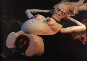


Joel-Peter Witkin


This photo is by Joel-Peter Witkin and it is called "Beauty has Three Nipples" and it was taken in 1998.  THis photograph is different.  I like his technique I will say that he scratches your negative and manipulated them as well.  He would sometime bleach his prints in the printing process and toned some of them as well.  He was inspired by living with a freak show and he found love there, but when he could not live with them he decided to take pictures of "freaks".  I think i like how he executes his photography more than the subject matter.  I say this because i am interested in him technique and how he printed his work.

Sunday, October 2, 2011

Week 5


Cindy Sherman

This photo was taken by Cindy Sherman and it is titled Untitled #250.
I like this photography because of the bizarreness of it.  And I like how are uses the mannequins as well. I think it just is different.  But I like it because of the  composition of the figure and the poster of it as well.  And the eyes of this figure seems lie ti is staring right at you and it is sort of scarryish.  Like it is starting you down.    


 web site:  Untitled250.jpg


Bruce Davidson


This photograph is by Bruce Davidson and and this sort of reminds me of a photo i took back in high school.  The photo I took back in high school.  I love the composition of the person where he was placed is very nice. I like that he doesn't take over the frame and i like that you can see the background.  The background is very interesting with this hazy sky and the circus tent.  I think that it makes the photo and helps the viewer to see that this might not of been staged that it was a decisive moment.


site:  http://www.magnumphotos.com/C.aspx?VP3=ViewBox_VPage&VBID=2K1HZSKA1WFE&IT=ZoomImage01_VForm&IID=2S5RYDWD5MJR&PN=4&CT=Album


Todd Hido


This Photograph is numbered 2312a and it is by Todd Hido.  I like the light that is being show in the sky.  I love the shadows as well. I think these two features of this photo gives it a creepy feeling.  I like the coolness of the photo as well.  I think i adds something else to the photo and it contrasts with the warm colors of the leaves on the tree.  normally Todd likes to have a light on in the house when he photographs but this one he doesn't which is odd.  


Site:  http://www.ahornmagazine.com/issue_6/interview_hido/interview_hido.html

Sunday, September 25, 2011

Week 4

William Eggleston


This photograph was taken by William Eggleston.  It is a very simple photograph and it is beautiful.  People say that he is the invited or created color photography, but he wasn't.  He was just on of the first people that used it and was able to make these wonderful photos with it.  The perspective of this photo is wonderful.  I like how it is  dominates the photo and i also enjoy the depth of field.  I think it is an interesting photograph and a wonderful picture.


http://www.egglestontrust.com/


Jerry Uelsmann


This is one of Jerry Uelsmann's earlier works.  I like this because of how the reflection of the top is in its negative form.  I think that is amazing.  That really captures my eye and i love how there are shadows of people or the children are white.  I think it gives it a creepy quality and i like the tonal range of this print as well.  This photo really keeps my attention and i think it was executed very well, especially since it was one of his newer works.  And on top of it all he did all of this in the darkroom.  That is extremely impressive.  This photo is called Small Woods Where I Meet Myself.


uelsmann_small_woods.jpg


Alec Soth


This photo comes from a project that Alec calls The Last Days of W.  I am drawn to this photo. I like the expressions on the women's faces because they are both different.  And by being different it makes you thing.  Is the viewer intruding on a moment that they were having or is that how they feel right at that second.  Also By having their legs somewhat crossing makes me think.... Are these two gay? are they lesbians? or are they prostitutes.  I also like how the color is portrayed in the photo as well.


http://alecsoth.com/photography/projects/the-last-days-of-w/

Monday, September 19, 2011

Portraits......

Meatyard


This photo is by Ralph Eugene Meatyard, I like this photo because it is a different photo compared to the other stuff he shoots.  I do like the whole mask thing, and the creepiness feel they give off. But This photo reminds me of a photograph that I took.  But the emotions hat are portrayed in this photo are strong and the house in the background is a nice touch to contrast with the lightness of the foreground.


Rinkeke Dijkstra 

   This is one of my favorite/ top photographers of all time!  I think her work is amazing and they are not just the typical portrait.  I think her pictures of full of these amazing situations and stories.  This photo is one of my favorites.  The little girl has this expression on her face that just love.  It is just straight,  hiding the emotion of all that she has been though. I like how neutral the background is compared to her dress as well.  It is a nice contrast.  And this photo over all is  just amazing because of this photographer would track this girl down every year and photographer.  Dijkstra did a series on her and the series is amazing!


Steve McCurry

 This photo is called Mother and Child.  It is by Steve McCurry, some of his stuff was in National Geographic, and his famous picture that he is most famous for is the Afghan Girl.  But i this one more.  How the water is on the windows and how the hand is touching it.  I love it.  But the look in the mothers face is subtle but the look on the face of her child is more amazing.  I like the fact that all colors in this are dark besides the dress of the mother.  It stands out and tries to brighten jup the photo.

Saturday, September 10, 2011

Weirdness...........


Bill Brandt

Campden Hill is a photo that was take in London in 1953. This photograph was taken at an interesting angle and perspective causing the model to have these enormously large arms and big hands.  I enjoy how Brandt is distorting the human body, making it seem different.  I enjoy this photo due to the contrast that the photographer used to create this picture.  It makes the picture all around more dramatic.  The figure or the subject looks like it has a feeling of plasticity making the model feel cold and fake.  


artwork_images_119642_415393_bill-brandt.jpg


Herb Ritts


This photo was taken in 1989 and it is called Djimon With Octopus.  This photograph is beautiful.  It is weird because there is an octopus on this persons head, however it brings the photo together.  I believe that if this sea creature was not on the head of this person,  this picture would just be a typical portrait.  ANd I love the fact that the eye of the sea critter is open as well because the model's eyes are closed.  The contrast on this photo is beautiful, it shows a nice variety of tones shadows ad highlights.

ritts_2_b.jpg


Arthur Tress

This photo is amazing!!!!!!!!  I do not know how he did this or if he found this or what not but i believe it is beautiful.  THe expression on the face is what i think makes the whole picture.  Also the tonal range is beautiful as well.  THe composition is ok.... but because the head of the figure is up so much, it makes the composition work.  THis is just a weird and unique photo that was captured in a beautiful way.   ANd i like the background as well.  The setting of this photo is interesting and adds to the photo as well.  It is called Singing Chair and was taken in 1977


singing_chair.jpg

Monday, September 5, 2011

Land people and a combination

Ansel Adams


The picture to the left is a photo taken by Ansel Adams.  It was taken at Yellow Stone National Park and in the year or 1948.  This photo has beautiful contrast between the tree trunk and the white of the snow.   I believe that the photo's composition is not very interesting but the subject itself is.  The tree's branches look very ornate and fragile which give the photo a exquisite and elegant look.   The tree looks extremely large compared to the other trees that were in the background of the photograph.   It makes the viewer wonder if the tree is really that big of if he took the photo from an interesting perspective.


http://www.pbs.org/wgbh/amex/ansel/gallery/gal_ansel_10.html


Diane Arbus


here we have a photo called Puerto Rican Woman with a Beauty Mark which was take in 1965.  First off i love the composition of this photography.  It takes up the entire frame with allows the viewer to focus on the subject.  Also how this image is so close up to the woman is nice as well.  It is nice because normally when one does portraits, it is of their whole or has more of their body in it.  this one is just their head with makes the photo a little more personal.


http://masters-of-photography.com/A/arbus/arbus_mark.html


Jerry N. Uelsmann


This photo is a combination of the two.  He does multiple exposures.   I like how he merges the landscape and the portrait of the woman into one photo.  it has an interesting composition and a uniqueness to it as well.  The contrast of the photo is beautiful as well.  There is an amazing amount of detail that is shown here and the photography is assembled beautifully


Jerry+Uelsmann.jpg

Tuesday, March 1, 2011

Surrealism/dreams

Here in the right is a photographer named Dan Mumford.  i like this photograph because of the exposure.  The castle being combined with eh head of the woman is very nice.  i like how her hair is also not just hair but it is plants or trees.  i think this is an interesting photograph.  I believe that this is an interesting take on a classic or "standard" portrait of someone.  


Above us right here is an amazing photography by Scott Mutter.  Here we see another multiple expose photo.  I think that the photographer has amazing ideas with his prints and what images to combine.  I like how the backround is foggy and hazy, and i also like how the door fits perfectly inside the rock.  
 I found this image at http://www.photographymuseum.com/mutter/revolving.html


Here above me is a photograph by Duane Michals .  The title of this piece is "Magritte with Hat."  I like the simplicity of the photo.  I think that the simpler the better sometimes.  However, the photo is complex as well.  I think that the layers of this photo is very  nice.  I do not believe that he as just two layers but he has exposed it three time.  I found this photo at  http://chagalov.tumblr.com/post/2346118735/magritte-with-hat-1965-by-duane-michals-via-ma