Tuesday, December 13, 2011

Week......... yeah i forget...

 Robert Mapplethorpe

i like this diptych.  i like the composition of it.  How one is sitting and the other is standing is nice.  i get two different feelings these photos.  one i get a proud, feeling or sense from while the other i get a sense of a blankness like no emotion.   the lighting is nice as well.
i dont like the mat of the photographs though.  i think if they were white or black they would be interesting and make the photographs pop.  


http://www.masters-of-photography.com/M/mapplethorpe/mapplethorpe_smith.html
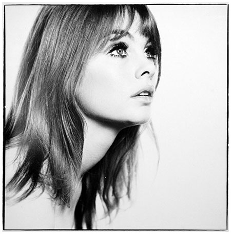


Lothar Wolleh


This photo i love.  i like the negative space. i think it is beautiful.  and the figure is place nicely in the frame.  and the only thing that is breaking up the whiteness of the walls is the black lines. i think it is interesting because of how blown out the print is.  but i love it


://masters-of-photography.com/W/wolleh/wolleh_delaunay.html


Jill Greenberg

AHHHHH!!!!!!1  this is amazing!!!!!!!!  i think this series of work is amazing! the emotion that comes out of the pictures are just powerful.  i think these are strong and can hit someone in the face with these pictures.  The color is nice and very picture is different.  all the kids are in different poses or positions and every little child cries differently as well so their emotion on every one of their faces are different.  I love it!

Monday, December 5, 2011

week something or other......

Brian Duffy
This is a photo that was taken by Brian Duffy and the model is Jean Shrimpton and was taken in 1963.  I like this because of the tonal range mainly.  I like how white the figure is in the photo and there is not a lot of variety on grays and black.  I like the simpleness of the photo as well.  and the expression on the face is amazing as well.  

http://www.duffyphotographer.com/archive_faces.html


Jay Maisel


I like the lighting in this photo.   How the only light that is being produced is because of the head lamps of the miners.   I think the negative and the positive space that the light creates is interesting as well.  And how yellow it is as well.  

http://studio.jaymaisel.com/collections/portfolio


Joan Myers   

  This is from a series from western power.  I like that it is symmetrical but it is not at the same time.  And the geometric shapes does wonders as well.  I like the monotone color scheme as well.   It makes the image more powerful.   I do think that there is a lot to look at in the photo but only if you look deep into the distance of the power plant but i think over all this is a wonderful print. 

http://www.joanmyers.com/westpwr3.htm